
Teleport Cities
Where is your best place to live?
PLEASE SAY HI
ABOUT THE PROJECT
Have you ever thought about relocating? Ever dreamed about living somewhere else? Wondering if you really live at the best possible place? Considering a job offer abroad? The place where we live has a huge impact on our personal life and happiness. Though it's pretty hard to find out if there is really a better one. The decision if and where you should move is complex. As we all have a pretty unique way of living, we all have a unique set of preferences. City guides might be helpful though, besides the fact they are written mostly for tourists, they rarely answer the hard questions. Important topics like costs of living, real estate markets, pollution, traffic, salary levels, crime statistics or many other life quality factors that might be relevant to you. Some magazines publish city rankings, but how helpful are they really? Ranking factors that were relevant for the editors, might be not relevant to you at all. And what kind of data did they use anyway?
You are not a tree. Move.
Teleport Cities inspires people to move.
Teleport Cities aggregates data for 300+ life-quality data layers from 100+ data sources for hundreds of cities. It helps you to create a personal city ranking, based on your personal needs and preferences. Calculate your personal Teleport Score for every individual city based on what you care about.
MY ROLE
In 2014 I had the pleasure to join the amazing Teleport team as third employee and became lead of product design. Teleport was founded in 2014 by Sten Tamkivi, Balaji Srinivasan and Silver Keskküla. It was backed amongst others by Andreessen Horowitz, SV Angel and Seedcamp. In 2017 it was acquired by Moveguides.
GOALS
The overall mission of Teleport is to help people to discover their best place to live and to help them to make the move happen. For the product Teleport Cities the goal is to inspire people to move. It wants to shorten hours of research on cities into a few seconds. It wants to make cities more transparent by aggregating all available data about life quality factors and by presenting analysis of that data in a way that enables users to make an informed decision about a potential move.
The focus was on a data driven approach first, to work with as many objective variables as possible. After a while we added community features like "Ask A Local", crowdsourced user data with survey widgets and later added more and more narrative content elements like videos, links to articles about cities, city blogs and more.
The focus was on a data driven approach first, to work with as many objective variables as possible. After a while we added community features like "Ask A Local", crowdsourced user data with survey widgets and later added more and more narrative content elements like videos, links to articles about cities, city blogs and more.
Your personal city ranking.
Match the individual preferences of users with the unique characteristics of a city.
Teleport doesn't believe in an absolute best city ranking. A city might be the best city in one particular data category, but releasing just one "best city to live ranking" like you might find in some magazines makes not much sense. If a city is preferable to others is always depending on the context and preferences of the individual person.
Our goal with Teleport Cities is to match individual preferences of each user with the unique characteristics of each city. We want to make cities comparable based on your personal needs.
Our goal with Teleport Cities is to match individual preferences of each user with the unique characteristics of each city. We want to make cities comparable based on your personal needs.
UX STRATEGY
Teleport Cities is a very data heavy product, that is used by an audience that is not necessarily used to work with data. Therefore three main challenges were central for our design development:
- Information overload: The product is about data, lots of data. How can we show only data that is relevant to users and in a way that the data is understandable and really helps to make decisions? How can we keep everything else out of the way?
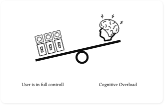
- Cognitive overload: How do we enable users to personalise their results based on their personal preferences without overwhelming them with a never ending list of choices and options. How can we avoid cognitive overload, but still keep the user in control and make the personalisation of results meaningful?
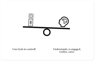
- Trust: Reducing cognitive overload comes sometimes with a downside, a lack of trust. Simplifying and distilling data that end up in comparable results like indices, reduces information and cognitive overload, though users might have a hard time to trust that data. Users feel out of control and don't know what's going on. Credibility and trust into data comes from transparency and having access to detailed data. How can we keep this trade off in balance? How can we make data comparable via normalising and aggregating data, but still give users a feeling for what these numbers mean? How can we use and show data users can relate to and maybe even verify themselves?
- Information overload: The product is about data, lots of data. How can we show only data that is relevant to users and in a way that the data is understandable and really helps to make decisions? How can we keep everything else out of the way?
- Cognitive overload: How do we enable users to personalise their results based on their personal preferences without overwhelming them with a never ending list of choices and options. How can we avoid cognitive overload, but still keep the user in control and make the personalisation of results meaningful?
- Trust: Reducing cognitive overload comes sometimes with a downside, a lack of trust. Simplifying and distilling data that end up in comparable results like indices, reduces information and cognitive overload, though users might have a hard time to trust that data. Users feel out of control and don't know what's going on. Credibility and trust into data comes from transparency and having access to detailed data. How can we keep this trade off in balance? How can we make data comparable via normalising and aggregating data, but still give users a feeling for what these numbers mean? How can we use and show data users can relate to and maybe even verify themselves?
PLEASE SAY HI
VISUAL DESIGN STRATEGY
Teleport is about finding a new home. It's not about science. It's a product for people who are not data nerds in the first place. Therefore we wanted to develop an overall tone for the design system that has not the technical feel right out of an Iron Man movie. On the other hand we knew pages will be information dense, so we wanted to avoid any additional noise. The main premise was to get with the design elements out of the way of data. Let's keep things clean and use visual elements only if they are necessary to visualise data. Colors are data. Images are data. If they don't signal data, we don't use them.
Of course we wanted to use visual elements and graphs to present data, though avoid the eye-candy and complex story telling part of information graphics. Work that looks beautiful, but would need minutes to be decoded was not part of our goal setting.
We wanted to develop a design system, that, similar to an editorial design system of newspapers, gets out of the way of the content. For the development process we used the methodology of an Atomic Design System. As an early stage startup we had the usual challenges of small teams that try to move fast. The optimisation of the design happened mostly via iterations. Shipping and moving forward was always preferred to making things perfect. Therefore the design system was developed on the fly and grew over time.
Get out of the way of data.
There will be always too much data on the site. Keep things minimal. Everything, even color, is data.
We tried to reduce the amount of elements of the site and keep things as clean as possible. This included color, as it is an important option to communicate data, we decide to avoid it as decorative element. Visual interestingness will come from the data itself.
As base system for the GUI we used the Google Material Design guidelines. Again the reason was to reduce noise for the user and not to establish any additional friction with new interaction patterns.
As base system for the GUI we used the Google Material Design guidelines. Again the reason was to reduce noise for the user and not to establish any additional friction with new interaction patterns.
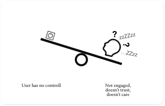
User Expectations vs. Picking Things from a Big Box of Data


Box with hundreds of data layers and thousands of potential preference settings…
ONBOARDING
There are two crucial onboarding flows for new users. One starts basically inside the Google search field. Users who start researching for data about a specific city and end up on a city page. The other usecase is about people who are thinking about relocating to a new place without a specific city in mind yet. People who are general curious about finding their personal best places to live. The flow of these users start on our main landing page. They discover Teleport mostly via content marketing channels, including social media, press articles etc.
In the following I focus on the later usecase, that brought for us the challenge shown above in the illustration. On the one hand our ambition and promise to deliver an unique experience based on a highly customised recommendation, on the other hand users that have the expectation to be not bothered with long onboarding flows and a great first recommendation.
In the following I focus on the later usecase, that brought for us the challenge shown above in the illustration. On the one hand our ambition and promise to deliver an unique experience based on a highly customised recommendation, on the other hand users that have the expectation to be not bothered with long onboarding flows and a great first recommendation.
Keep it short. Let them explore.
Trying to tell the full story on the landingpage prevented users from exploring themselves.
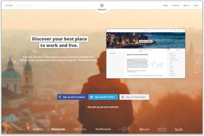
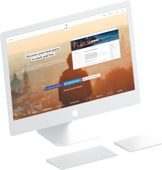
The onboarding starts on the homepage. In the beginning we had a classic approach. A long page that tries to tell the full story about Teleport. The value proposition, the main features explained in detail, testimonials, the full set of a classic startup page. A lot of call to action buttons all over the place, what could go wrong, right? During a growth sprint week, we took the time to try some more radical landing page designs in A/B tests. It turned out that short pages (no scroll) converted much better, than long detailed ones. Instead of wasting their attention with exploring the homepage, you could use it to already explore your product. From now on we focused on just introduce the product on the homepage, instead of explaining it. A short screencast video that teases the userinterface, a row of press logos for social proof and the value proposition communicated in just a head- and subline. That's it.
Also we gave users a way to start the onboarding without signing up.
Though the homepage was not yet about the core challenge of the onboarding as mentioned above. Providing a personalised first recommendation while keeping the onboarding as short as possible was the goal.
Leading users through a questionnaire of 25 different life quality factors and about 50 questions is certainly not the answer.
As having a short onboarding is not negotiable, we decided to approach the problem by trying to build a first rough profile of the user in just one step, hoping the 20:80 rule applies here as well. After showing the first results we wanted to give users then the ability to fine tune their preferences and make the results even more relevant.
We looked into some mechanics of other recommendation services and took some inspiration from music services. What if we could create a tag cloud of characteristic terms about what people care about most when choosing a place to live?
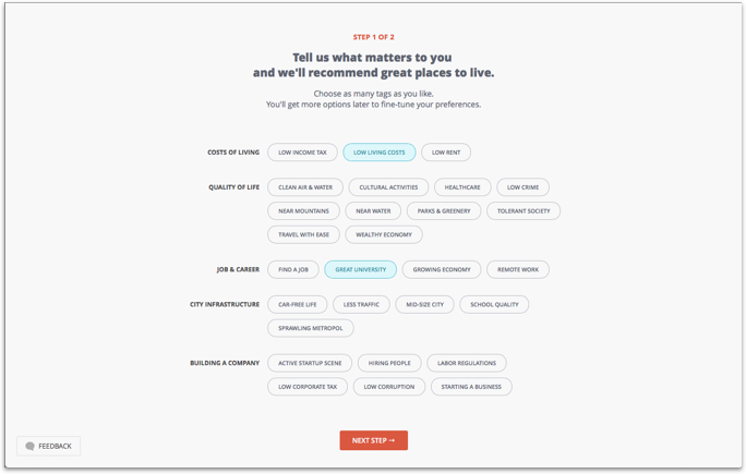
Each of these tags could be routed to a certain profile of preference settings. Choosing a few tags is a much easier and less cumbersome way than answering questions, though our algorithms could generate already a first set of preference settings that approach already pretty close the places and things you care about.
A big feature of Teleport is generating financial forecasts for different locations, like salaries, costs of living. In order to be able to calculate these we needed to ask a few questions about your current living conditions for generating a baseline. So in the end we had a two step onboarding process. In the first step users choose terms that matter most to them. In the second step users enter some baseline data like their profession and salary level to be able to forecast monetary data like costs of living or salary levels in each of the cities. These two steps enable the Teleport algorithm to give users already a first meaningful ranking and filter for cities based on a calculated Teleport Match Score. After the onboarding we give users the full control over their preferences and enable them to fine tune.
A big feature of Teleport is generating financial forecasts for different locations, like salaries, costs of living. In order to be able to calculate these we needed to ask a few questions about your current living conditions for generating a baseline. So in the end we had a two step onboarding process. In the first step users choose terms that matter most to them. In the second step users enter some baseline data like their profession and salary level to be able to forecast monetary data like costs of living or salary levels in each of the cities. These two steps enable the Teleport algorithm to give users already a first meaningful ranking and filter for cities based on a calculated Teleport Match Score. After the onboarding we give users the full control over their preferences and enable them to fine tune.
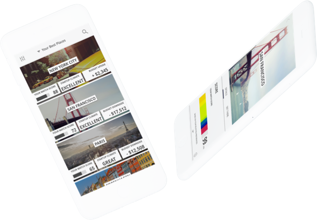
TELEPORT SCORES
In order to make cities easier comparable Teleport calculates scores for cities and certain life quality factors.
The Teleport Match Score is the main index. An algorithm calculates it based on the city performances in each of the life quality categories and based on the individual preferences of a user. It basically shows how well a city matches to your needs. It is the basis for the personal city ranking of a user. The Teleport Score is visualised via a color bar. Each life quality category has a specific color. Via the length of each color the user get an overview how strong the input of each category is on the overall score. As mentioned above, Teleport believes there is no "best city of the world" ranking. There is only a "best city for you". The Teleport Match Score makes this ranking possible.
The Teleport Match Score is the main index. An algorithm calculates it based on the city performances in each of the life quality categories and based on the individual preferences of a user. It basically shows how well a city matches to your needs. It is the basis for the personal city ranking of a user. The Teleport Score is visualised via a color bar. Each life quality category has a specific color. Via the length of each color the user get an overview how strong the input of each category is on the overall score. As mentioned above, Teleport believes there is no "best city of the world" ranking. There is only a "best city for you". The Teleport Match Score makes this ranking possible.
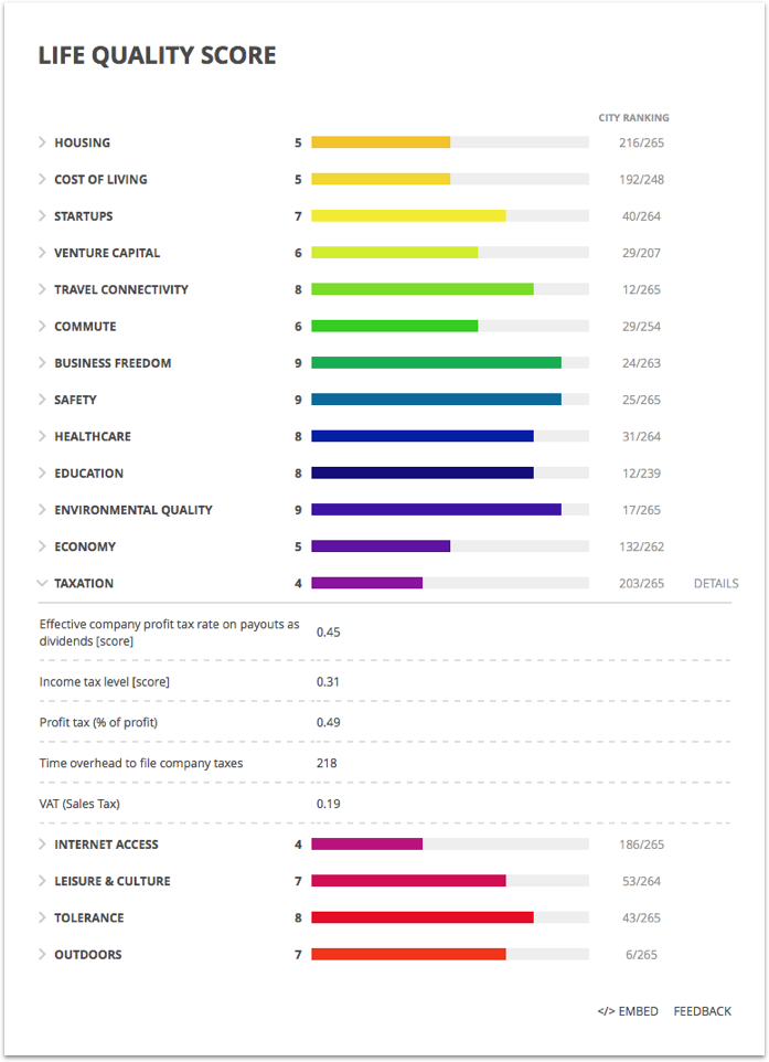
For each individual life quality category the Teleport algorithms calculate a separate score for each city. We call these a Teleport Life Quality Score. That way we try to offer an objective way to compare cities head to head in certain areas. As with all indices or rankings that you create, people sometimes have a different perception of things and question data. The only way to get users trust is to signal the underlying decisions, sources and data. So we tried to find ways to make these available whenever possible, without blowing the site. The dropdown menu in the score above is an example.
PLEASE SAY HI
RANKING & PREFERENCES
Another important way to earn the trust of users for your data is to give them control over the preferences that generated the ranking. That way users have a way to shape the results in a significant way, can fine-tune there preferences, and through playing around with data even try to verify the data.
Different to the tag cloud in the onboarding, this time we offer users on the left side a column with a detailed list of all relevant life-quality factors that they have chosen to activate. By choosing one of the preferences a second column shows detailed options to adjust the preference
If users make any changes in the settings, they see a real time update of the city ranking. Hundreds of individual preference settings allow them to fine tune their personal city ranking.
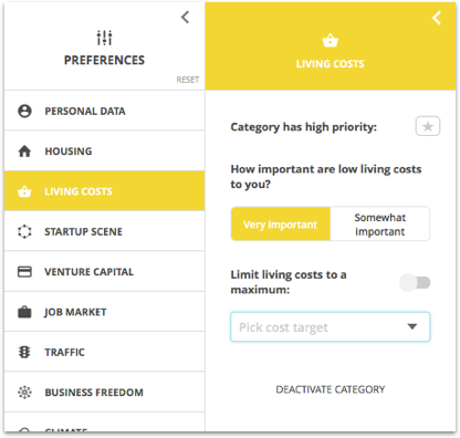
The preferences themselves had a couple of challenges. One was finding a good way not only to activate a life-quality factor as relevant, but also to state that this one is even more important than the other ones. This weighing of each factor though runs easily into the issue of cognitive overload. Certainly we want to give users the option to express their priorities, on the other hand giving them the option to weigh each of the factors in detail ends up in asking too much from someone who is not familiar with the algorithm itself. In the end it's messing up the results more than optimising them. Anyone who ever started color correction in Photoshop as a newbie, knows how that feels.
Another challenge was to educate the user that certain preferences not only had an impact on their matchscore and therefore ranking, but also that this preference would filter the ranking. So if you have chosen to choose only English speaking cities, certain cities don't show up in your ranking anymore. Seems obvious, though after you have played a couple of minutes with your preferences you might forget about that choice and wonder why certain cities are not showing up in your list.
Another challenge was to educate the user that certain preferences not only had an impact on their matchscore and therefore ranking, but also that this preference would filter the ranking. So if you have chosen to choose only English speaking cities, certain cities don't show up in your ranking anymore. Seems obvious, though after you have played a couple of minutes with your preferences you might forget about that choice and wonder why certain cities are not showing up in your list.
Give users control to earn trust for your data
It only works, if users can understand what they are actually doing.
CITY PAGES
Obviously a central part of the site are the city pages. As the amount of data that we aggregated grew over time, we wanted to build a site structure that makes it easy to add and also hide data areas without messing up the site. So we decided against a complex multicolumn dashboard design that would decrease our flexibility, but also would increase the information density on the page a lot. In a multicolumn setting several data categories would be interdependent. If you change the page a lot, you would have to deal with a lot of adjustments of existing data widgets so that the overall balance of the site feels good. Furthermore in most cases it would limit the space for each category to visualise the data.
Therefore we went with a single column card system, that gave each important life-quality factor its own cards. On each card we used the space to give more background information for the specific life-quality category. Some cards were interactive and allowed the user to further specify the data.
Over time we also added cards that allowed us to crowdsource data from users. These were only shown when we had a big likelihood that the user could provide data. If it was unlikely, we hide these card.

The City Page. Yes, it's a long one. (Feel free to scroll the screenshot.) Therefore we tried to show only data cards to users that are pretty likely in the interest of the specific user. If a user is not interested into a certain life-quality category we hide the card.

THE COMPARE VIEW
There comes a point in the research when users have a shortlist of several cities that they are particularly interested in. It's the phase when they want to compare two or three cities in detail head to head. Therefore we built the compare view. The user could choose two or three cities and compare them in a table view. It allows you to compare each life quality category line for line. A little dot signals which of the cities has won each category. You will see that even though a city might win the most categories it doesn't have to the higher Teleport Matchscore for you personally, because of your individual preferences.
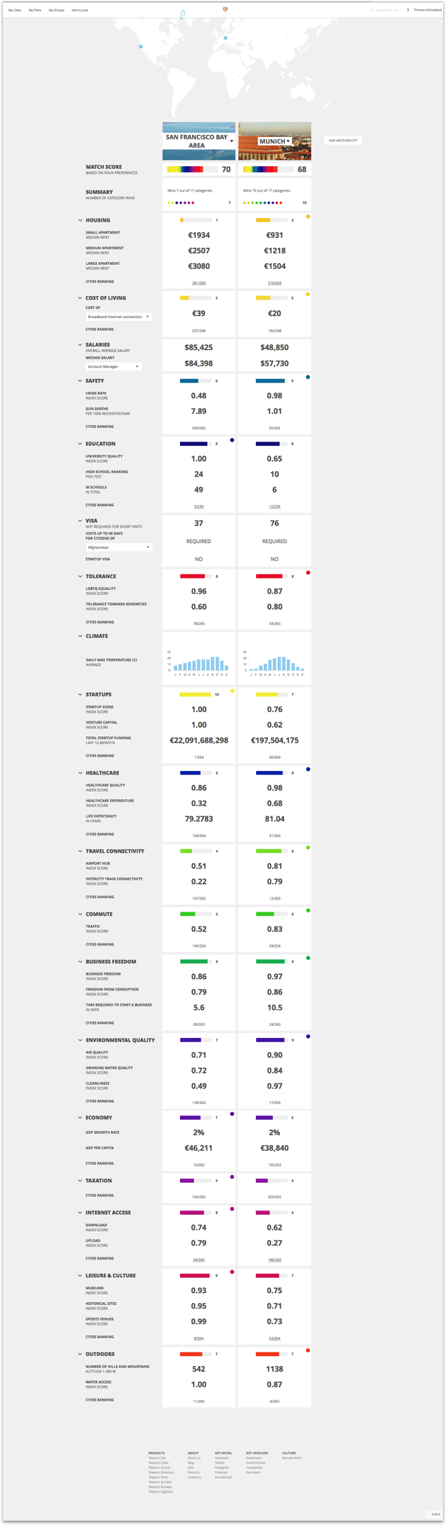
The compare view is also a list of cards. Each card has the life-quality score on top and is expendable to display the core stats of each category.
With expanding or collapsing of the cards the user decides how much information is on the site and how long he wants to scroll ;) (Feel free to do so on the left).
Via the dropdown functionality on the city name users can quickly choose other cities and teleport around the world.
With expanding or collapsing of the cards the user decides how much information is on the site and how long he wants to scroll ;) (Feel free to do so on the left).
Via the dropdown functionality on the city name users can quickly choose other cities and teleport around the world.
NEIGHBORHOODS
As much as your choice of country and city have a huge impact on your life-quality, the choice of your neighbourhood is as important. In the end the choice of neighborhood defines your final costs for housing, daily commute and many other factors like safety or access to the outdoors etc.
For a several major cities in the US like San Francisco Bay Area, New York City, Los Angeles or Seattle, we developed a neighbourhood view that gives users on a ZIP level detailed neighbourhood recommendations.
For a several major cities in the US like San Francisco Bay Area, New York City, Los Angeles or Seattle, we developed a neighbourhood view that gives users on a ZIP level detailed neighbourhood recommendations.
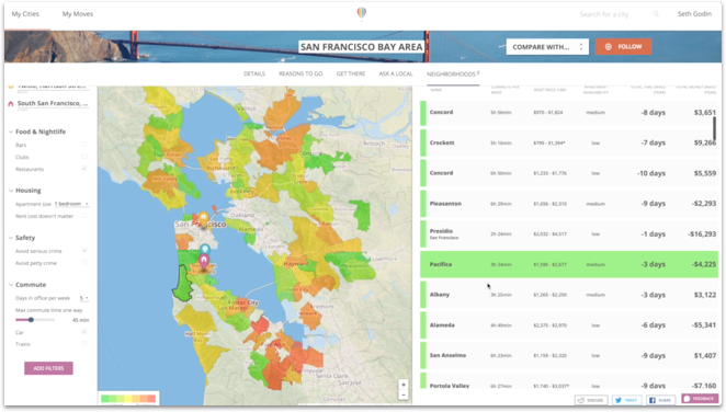
Optimizing your neighbourhood could have a big impact on your life quality, disposable income and commute times. In Teleport neighborhoods users can choose their personal preferences, like maximum commute times, nightlife, outdoors and recreation etc. and see on a heat map the areas that fit best to their needs. A rent and commute calculation gives you an overview about how much time and money you could save if you move.
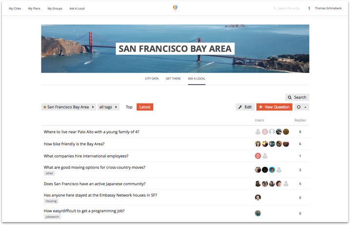
ASK A LOCAL
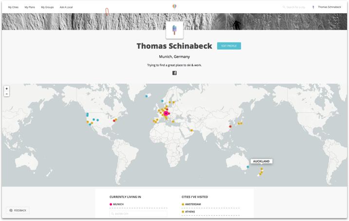
Data is great, though there are limits to what a data widget could tell you about a city and what it means to live there. With Ask A Local we built for every city a little community that connects locals with people who are interested to move there. A question and answer platform that forwards every question to Teleport users who are currently living in the corresponding city. Get first hand answers to all your questions from people who know the city. Building this little community also engaged us to build user profile pages, where users could show in which cities they lived so far, where they have been before and in which they might be interested in the future. Bringing people on the move together.
STILL CURIOUS?
Working on a project for so long makes it hard to summarise it in a case study, which in the end can give just a little glimpse anyways. It was honour to be part of that amazing Teleport team and great fun to help building this product. If you are still reading this and you are curious about learning more, please contact me. Happy to chat.